- Tools
- Learn
- Help
×
Before you leave..
Why not download RevGlue latest free eguide.

Humans have always been visually oriented. Visual forms have been used to chronicle history and transmit ideas from the dawn of time. Content creators have only recently sought to acquire the psychological advantage of employing color in content marketing to accentuate brand and inspire viewers to act, thanks to the emergence of advertising and now the ever-increasing role of personal technologies.
People and brands alike want to share the moment something happens in today's content-driven society. Visual communication (and the color inherent in those visuals) is faster and more effective than spoken communication. Consider what goes viral: only visual stuff can go viral. Color and images are processed differently by humans.
In our daily lives, color symbolism is quite essential. They have an impact on how we think, how we make decisions, and how we feel. Colors have more power than we realize, from generating changes to affecting reactions. They can be utilized for both good and evil, depending on our interpretations. Fortunately, humans can accept some colors while rejecting others. This content will take you on an adventure into the fascinating world of color meanings.
It's crucial to remember that not all colors are made equal. Even if certain shades look alike, that doesn't mean they'll evoke the same feelings. We must learn to accept this to comprehend the meaning of color properly. It's also necessary to give up some control. We will not always be able to control our emotions, no matter how hard we try.
Content
What is Colour Psychology?
The study of colors in connection to human behavior is known as color psychology. Color influences our daily decisions, such as what we buy. Is the color of a dress enough to entice us to buy it? Yes, in a nutshell, but then why is it a little more nuanced. The significance of colors can influence why we choose specific colors over others. Depending on our upbringing, gender, geography, values, and many other circumstances, the same color can have distinct meanings.
Color elicits emotions. It elicits an emotional response. When it comes to choosing colors for your business, it's no different.
Choosing the appropriate colors for your content development efforts can make all the difference in whether your brand stands out or blends in. You can have your audience see what you want them to see and help them view how you want to be perceived by carefully integrating colors in your content initiatives. This is why an essential awareness of color symbolism can be highly beneficial to your content creation efforts because it may assist you in portraying your brand in the manner that you desire.
Colour Symbolism?
While picking the appropriate colors might improve your brand's impression, choosing the wrong colors can harm your brand's image. For example, if you use the wrong colors for your text or logo, it will be less readable and difficult to grasp by your audience. You can even risk being completely ignored.
Content creators can use color to impact how consumers think about and behave toward a brand and how they comprehend information. Colors can assist people in determining what is essential. That is why content creators must comprehend the meaning of various colors.
What‘s Colour Got to Do With Creating Content?
It seems to reason that you're up against a lot more than you think if your audience's attention and memory are being pulled in so many directions. Every day, massive amounts of content are produced. It's no longer enough for a piece of content to be well-designed and functional. Almost everyone nowadays is capable of producing high-quality content. If you use color strategically, you can get an advantage.
The human brain uses color to break down complex visual data into easily digestible bits for interpretation. Because so much data is coming in, marketers must figure out how to create content that sticks out. Successful content must assist prospects in translating what they see into something they want to do to produce a return on investment. Visual data and color choices capture the eye of a prospect and convey a lot more than just color.
Colors and Their Meaning
Red Colour Meaning
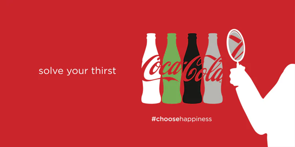
Red is an attention-getting color in marketing. Excitement, passion, danger, energy, and action are all associated with the color red. As a method to stand out on the shelf, some brands choose red for buttons that say "order now" or for their packaging. Red is the most intense color in color symbolism. As a result, it can elicit the most intense emotions. Because red can conjure up images of danger, it's best to use it sparingly. If you use red on your website, save it for the call to action or sale icons if it blends nicely with the rest of the design.
Coca-Cola and YouTube are both known for their use of the color red. Red is a color that stimulates appetite, which is why Coca-Cola uses it frequently in its branding. They also employ the color red to promote excitement since they use phrases like happiness in their branding.
Orange Colour Meaning
Orange denotes innovation, adventure, enthusiasm, success, and balance in color symbolism. Orange provides a splash of color to any photograph, website, or marketing piece. Despite its appeal, it lacks the authority of the color red. Many content creators still use color to bring attention to call to actions or locations they wish to draw attention to.
The meaning of orange may be seen in logos such as Nickelodeon's and The Home Depot's. Nickelodeon is a children's channel. Therefore the logo's lively orange color perfectly portrays the originality and energy that a children's show would require.
Pink Colour Meaning
Pink is a popular color for brands that cater primarily to women. Pink is associated with femininity, fun, immaturity, and unconditional love in color symbolism. Pink has been adopted by some manufacturers for product packaging, particularly for girl's toys. On the other hand, other firms use pink in their logo, website design or to emphasize essential points.
It's not new that brands like Victoria's Secret and Barbie employ pink so frequently because the color's meaning encompasses femininity. One of Victoria's Secret's brands is even named Pink. To highlight essential marketing details on their website, they employ a combination of pink and black.
Green Colour Meaning
Green is closely associated with nature and money in color symbolism. Some of the excellent color meanings for the color are growth, fertility, health, and generosity. Green's color meaning also has certain negative connotations, such as envy. If you're into the health or fitness industry, you might want to make your online business greener. A green background, for example, could be used in your homepage banner image or logo.
Brands like John Deere and Roots have popularized the usage of green. The entire John Deere brand is centered on nature. Landscape, agriculture, lawn care equipment, and other products are all part of their product portfolio.

Blue Colour Meaning
The color blue is associated with the sea and the sky. When you use the color blue in your branding, your customers may experience feelings of stability, harmony, peace, tranquility, and trust in your brand. On the other hand, blue can have negative connotations, such as depression, and can evoke a feeling of coldness. Some merchants use blue to highlight their guarantee, trust certification, or free shipping icons, reinforcing the color's reputation for trust.
Blue is frequently used in the marketing of technology companies such as Facebook, Twitter, and Skype. However, merchants such as Boots and Oral B employ color. The blue in the Boots logo can assist in positioning the company as a leader in the industry.

Purple Colour Meaning
Purple is considered a royal color. Purple is a color associated with power, grandeur, elegance, knowledge, and spirituality. However, don't overuse the color because it can lead to frustration. Its overuse is viewed as arrogant by some.
Purple is a color that is used by companies such as Hallmark and Yahoo. You'll notice that purple is used as an accent color on both websites. The logo and top navigation on Hallmark are purple, but the remainder of the site is a rainbow of colors.
White Colour Meaning
White symbolizes purity, innocence, cleanliness, and humility. White has a negative connotation in several places of the world. Depending on the target population you serve, you'll want to keep this in mind. White also has a negative connotation, as it is associated with sterility and coldness. White is the most commonly used color on eCommerce websites. It'll most likely be the backdrop color for your product photograph.
ASOS and Adidas use the color white in their marketing. The words in the header, logo, and background of ASOS are all white. The typeface is white when the background is grey or black and black when the background is white.

Black Colour Meaning
In the retail industry, black is a popular color. Black is associated with power, mystery, elegance, and refinement in color symbolism. Color meaning, on the other hand, can elicit negative feelings such as grief and wrath. Black has been utilized in the logos of several fashion retailers. Black is also a standard font color since it is simple to read. Some companies pick black and white photography for lifestyle banner graphics or icons to achieve a specific tone or consistency on their website.
Chanel and Nike, for example, employ black as a color. Chanel uses black for their emblem to keep a consistent design and has various black and white photos on their website.

Grey Colour Meaning
Grey color symbolizes balance and neutrality. Its color meaning is most likely derived from the fact that it is a shade between white and black. On the other hand, grey has a negative connotation, especially when it comes to depression and loss. It is drab due to its lack of color.
Apple is an example of a company that uses grey in its branding. After all, many of their computers are grey or silver-toned, which is a neutral color that no one minds. To contrast a white logo on their website, they use the color grey for their header.

Brown Colour Meaning
Brown is a natural color. It is, after all, the color of the earth, wood, and stone. As a result, color symbolism reveals that brown is associated with comfort, security, and a natural state. Brown is a color that is frequently used in marketing for natural products and food. Due to its contrast on a white background, brown is a color that appears in logos, banner pictures, and occasionally even text.
UPS is a company that uses color to convey meaning in its branding. The brown in their logo is highlighted in the navigation and drop-down menus on their website. You'll probably notice that complementary colors like yellow and green have natural.

Wrapping Up
Choosing colors to reflect your company might be difficult. Keep in mind that you will be investing a significant amount of money in your brand over time.
You'll want it done correctly the first time to avoid having to spend money on rebranding later on.
Making cautious, intelligent color choices now will pay dividends in the long run. Be careful not to be overly subjective. Of course, this isn't a precise science. People may have personal preferences that take precedence over deeper biological tendencies, cultures interpret things differently, and other factors may be considered.
Now that you're familiar with the meanings, you can experiment with them to determine what works best for you.


![Latest affiliate marketing stats [infographic] – you need to know](https://www.revglue.com/resources/common/blog/v3b2hOyUornDionE.jpg)